Loading...
Responsive Web Design

Websites That Look Perfect on Every Device

Mobile-first responsive websites that adapt seamlessly to desktops, tablets, and smartphones — delivering an optimal user experience everywhere.
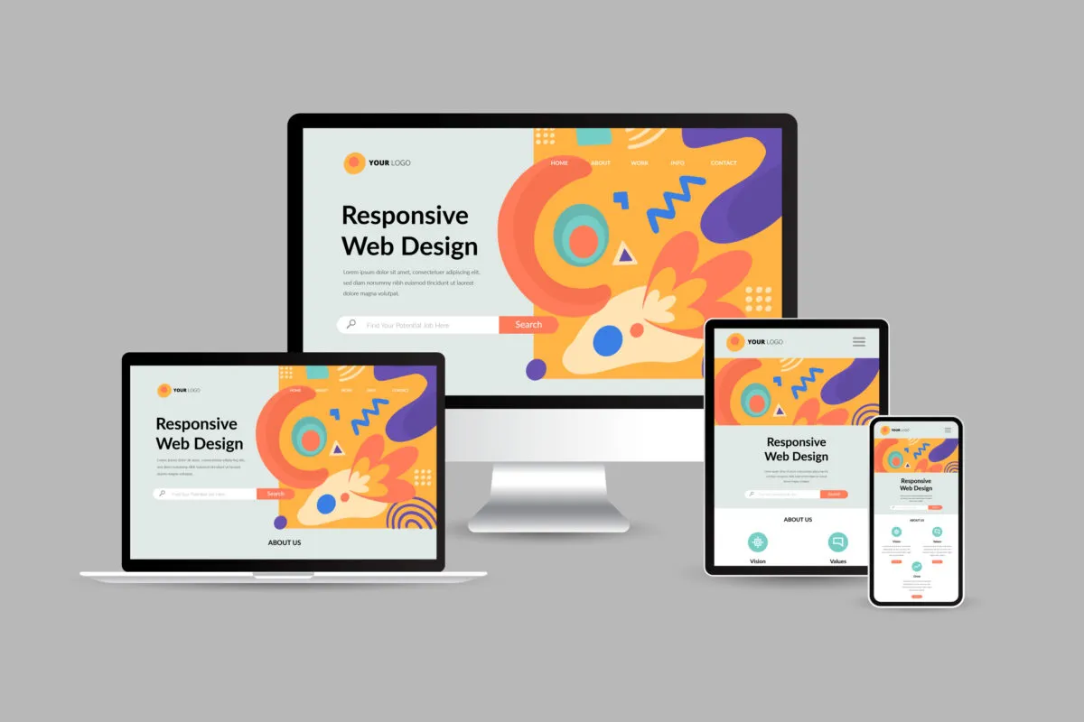
Responsive Design Illustration
What Is Responsive Design?

One Website. All Devices. Perfect Experience.

Responsive web design is an approach that ensures your website looks and functions flawlessly across all screen sizes — from large desktop monitors to smartphones and tablets. Using flexible grids, fluid images, and CSS media queries, your website automatically adapts to the user's device.

With over 60% of global web traffic coming from mobile devices, having a responsive website isn't optional anymore — it's essential for business success.

Desktop

Tablet

Mobile

What We Offer

Responsive Website Design Services

Mobile-first designs that engage users and drive conversions

Mobile-First Design

We design for mobile devices first, then scale up to larger screens — ensuring optimal mobile experience.

Touch Optimized Fast Loading

Tablet-Optimized Layouts

Perfectly tailored layouts for iPad, Surface, and all tablet devices with touch-friendly interfaces.

Landscape/Portrait Touch Navigation

Desktop Experience

Rich, full-featured desktop experience with advanced layouts and interactions.

Full Layouts Hover Effects

Fluid Grid Systems

Flexible grid layouts that automatically adjust to any screen width and resolution.

Flexible Columns Auto Scaling

Responsive Images & Media

Optimized images and videos that scale perfectly without losing quality or slowing down.

Lazy Loading WebP Format

SEO-Optimized Structure

Google recommends responsive design. We ensure your site is fully optimized for search engines.
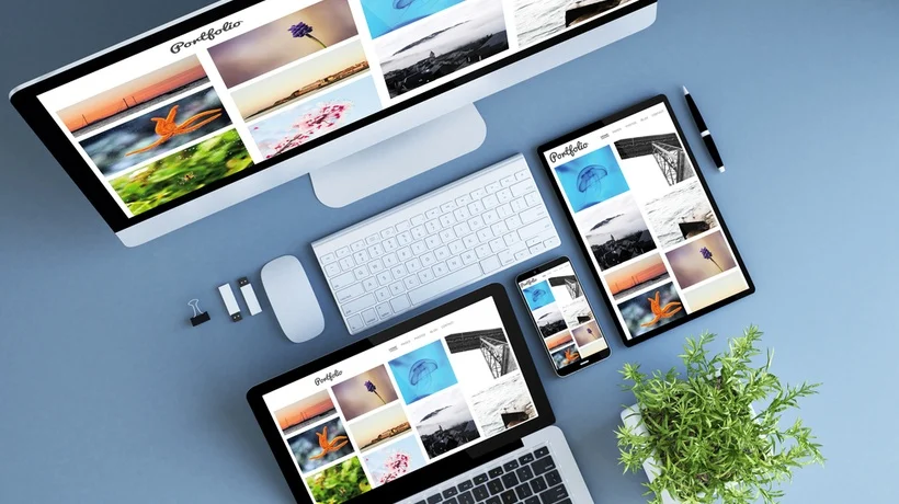
Mobile-First Indexing Fast Loading
Why Responsive Design?

Key Benefits of Responsive Websites

Better SEO Rankings

Google prioritizes mobile-friendly websites in search results.

Higher Conversion Rates

Optimized mobile experience leads to more sales and leads.

Cost Effective

One website for all devices — no separate mobile site needed.

Better User Experience

Consistent experience across all devices increases engagement.

Device Compatibility

Works Perfectly On All Devices

We test your website on real devices to ensure flawless performance

iPhone
Android
iPad
Windows
MacBook
All Browsers
How We Work

Our Responsive Design Process

A systematic approach to create pixel-perfect responsive websites

1
Strategy & Wireframes

Plan layout structure for all device breakpoints and create wireframes.

2
Mobile-First Design

Design for smallest screens first, then progressively enhance for larger devices.

3
Development & Testing

Build with fluid grids, flexible images, and test on real devices.

4
Launch & Monitor

Deploy and continuously monitor performance across all devices.

Our Toolkit

Technologies We Use

Modern frameworks and tools for responsive excellence

Bootstrap
Tailwind
CSS3
JavaScript
Figma
SASS
Our Work

Responsive Website Portfolio

See how we've helped businesses go mobile-friendly

Responsive Business Website
TechCorp Solutions

Fully responsive corporate website with seamless mobile experience.

View Project →
Responsive Restaurant Website
Spice Garden Restaurant

Mobile-optimized website with online ordering and reservations.

View Project →
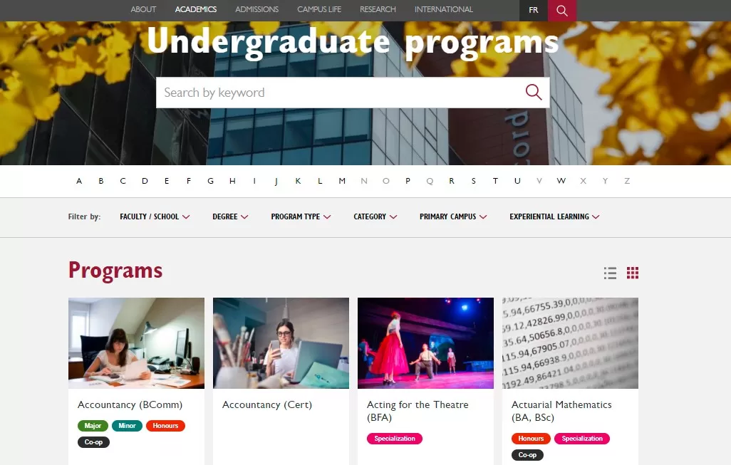
Responsive Educational Website
Bright Future Academy

Responsive educational portal with course listings and enrollment forms.

View Project →
Pricing

Affordable Responsive Packages

₹15,999

Starter Responsive


  • Up to 5 Pages
  • Mobile-First Design
  • Tablet Optimized
  • Contact Form
  • Basic SEO
  • 1 Month Support
Get Quote
Popular

₹29,999

Professional Responsive


  • Up to 12 Pages
  • Advanced Mobile Features
  • Cross-Browser Testing
  • Performance Optimization
  • Complete SEO Setup
  • 3 Months Support
Get Quote

Custom

Enterprise Solution


  • Unlimited Pages
  • Custom Responsive Features
  • Advanced Interactions
  • Priority Support
  • 12 Months Maintenance
Contact Us
FAQs

Frequently Asked Questions

What is the difference between responsive and mobile-friendly?
Mobile-friendly means a website can be viewed on mobile but may not adapt perfectly. Responsive design actively adapts layout, images, and content to fit any screen size — providing an optimal experience on all devices.
Will my existing website be made responsive?
Yes! We can convert your existing non-responsive website into a fully responsive one. We'll assess your current site and provide a timeline and cost estimate for the conversion.
How do you test responsive websites?
We test on real devices (iPhone, iPad, Android phones/tablets, various desktops) and use industry-standard testing tools to ensure compatibility across all major browsers and screen sizes.
Does responsive design affect website speed?
Properly implemented responsive design actually improves speed. We optimize images, use lazy loading, and implement performance best practices to ensure your site loads quickly on all devices.

Ready for a Responsive Website?

Get a website that looks stunning on every device and drives more business.

Get Free Consultation